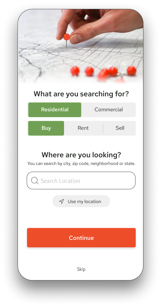
Designed a responsive real estate app and website with an intuitive, visually appealing interface for effortless browsing, searching and contacting agents.
SUMMARY
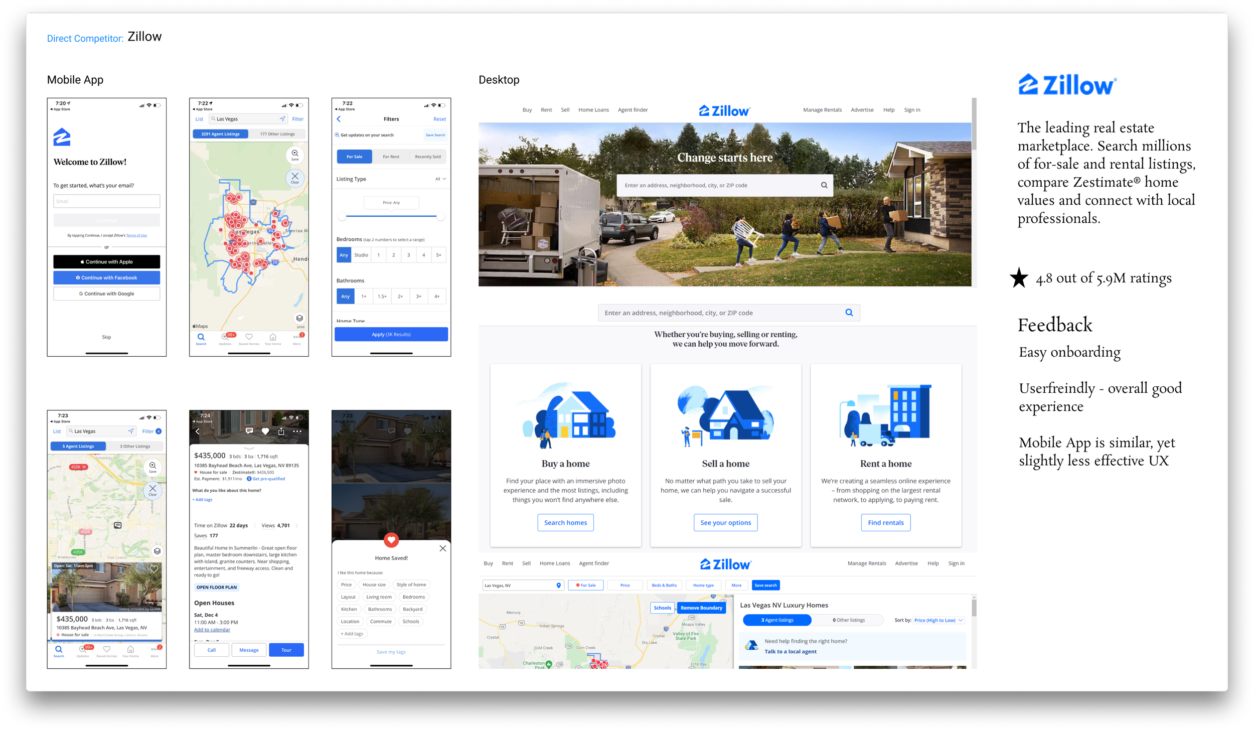
During the UI/UX design process for this real estate website and mobile app, I conducted competitive research to understand strengths and weaknesses. I developed low-fidelity wireframes to explore and iterate on layout and functionality, then transitioned to high-fidelity prototypes to refine the design details.
Key features such as advanced search filters, interactive maps, virtual tours, and seamless communication tools were integrated to enhance user experience. The final design ensures a responsive and visually appealing interface that adapts seamlessly across devices, providing a consistent and engaging experience for users.
ROLES
User Experience
UI Design
Research
TOOLS
Figma
HeyCollab
RESPONSIBILITIES
Competitive Research
Moodboards
Sitemap
Low Fidelity Sketches
High Fidelity Wireframes
Prototype
CHALLENGE
The challenge for MyPlace lied in three key pain points: a lack of personalization, difficult navigation, and nothing setting them apart and above competitors.
SOLUTION
To address this challenge, I leveraged user research and feedback to design an intuitive, responsive interface that prioritizes ease of navigation and personalized experiences, integrating advanced search capabilities and real-time communication tools. This design enhances the app's distinctiveness in a competitive market by incorporating innovative features such as virtual tours, AI-driven property recommendations, and a visually striking design that conveys professionalism and trust.
THE PROCESS
1
COMPETITIVE RESEARCH
The initial step is to comprehensively analyze the competitive market landscape. This involves examining the offerings, strengths, and weaknesses of existing real estate applications.
2
MOODBOARD
Creating a moodboard for a real estate app involves curating a collection of colors, textures, fonts, and imagery that convey a sense of elegance, trust, and professionalism, setting the visual tone for an inviting and user-friendly interface.
3
SITEMAP
Developing a sitemap for the UI/UX design process of a real estate app is crucial as it provides a structured blueprint, ensuring logical navigation, efficient organization of content, and a seamless user experience across the platform.
4
USER EXPERIENCE
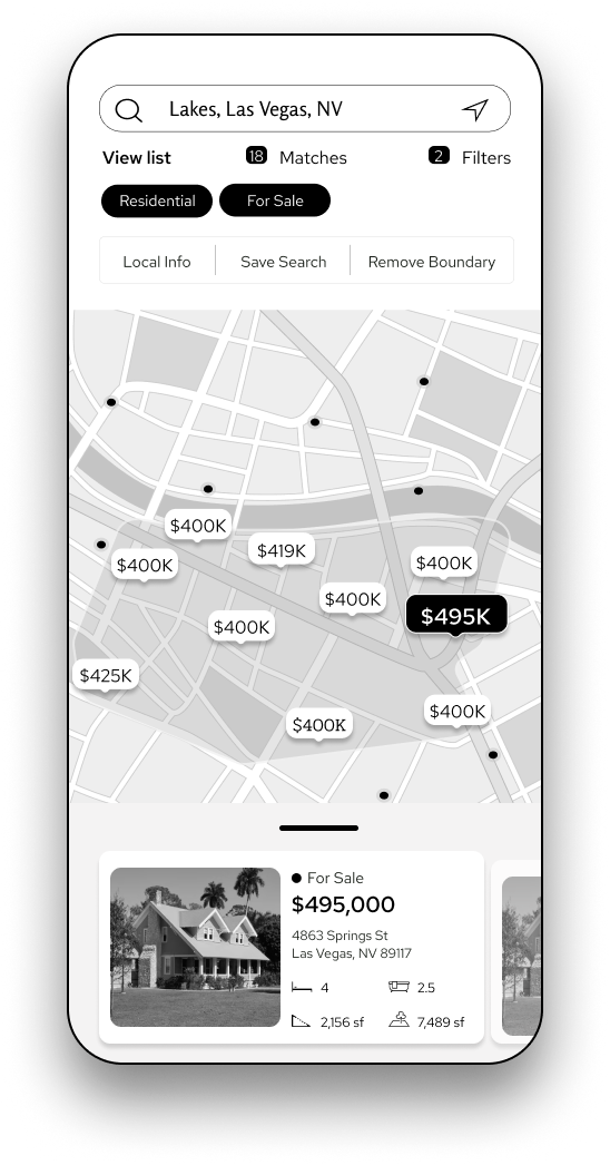
Designing the user experience with low-fidelity sketched wireframes first allows for rapid iteration and exploration of layout and functionality, facilitating early feedback and alignment with project goals. These wireframes serve as a foundational blueprint, enabling a focus on the structural aspects of the interface before delving into finer details.
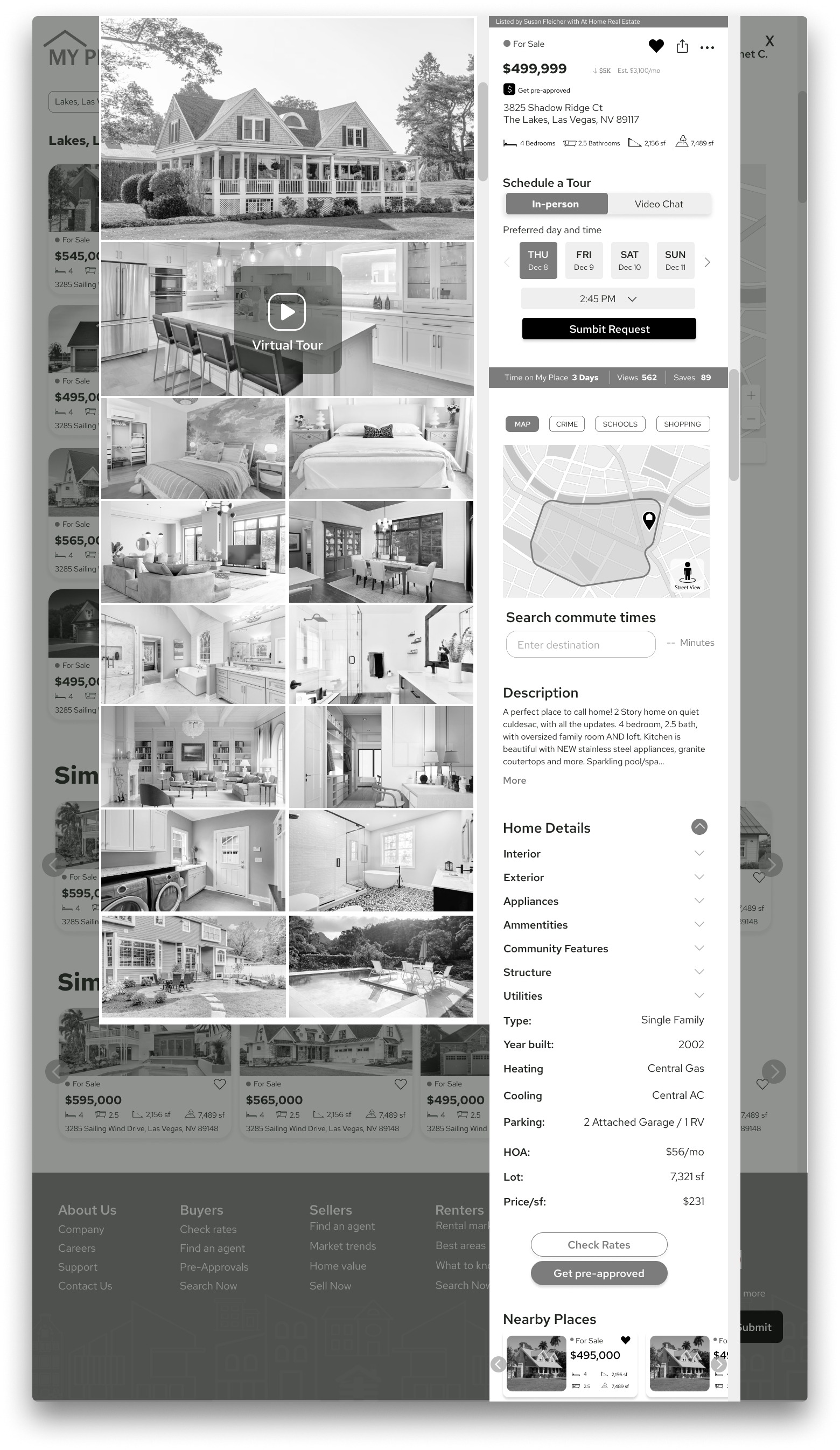
Transitioning from low-fidelity sketches to UX wireframes provides a more detailed blueprint, refining layout, functionality, and interactions while maintaining flexibility for iterative improvements and feedback. This approach ultimately shapes the foundation for the app's user experience before moving into higher-fidelity prototyping stages.
Sketches
Low Fidelity Mobile
Low Fidelity Desktop
5
USER INTERFACE
This responsive real estate interface is designed to be a seamless and intuitive experience that caters to users on various devices. This process started with understanding user needs and behaviors, leading to a clean and organized layout that prioritizes ease of navigation. Essential features like property search, detailed listings, high-quality images, and interactive maps are designed to be accessible and visually appealing across different screen sizes.
Ensuring fast loading times, incorporating filters, and providing easy contact options further enhance the user experience. The interface is aesthetically pleasing, using a consistent color scheme and typography to evoke trust and professionalism, while responsive design principles ensure a smooth and consistent experience on smartphones and desktops.


